November 2010 arichives


November 9, 2010

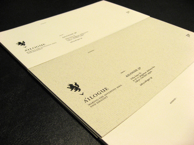
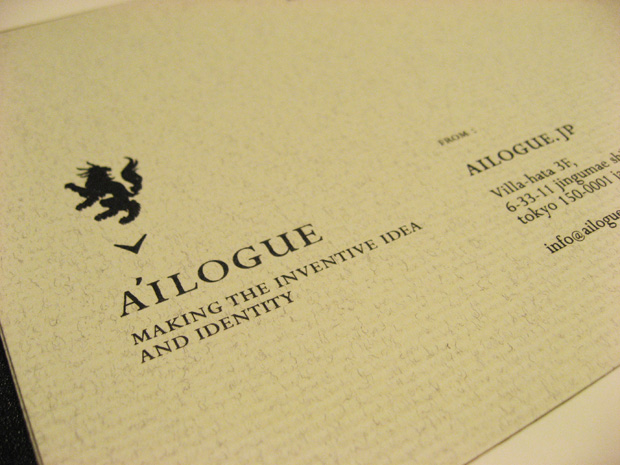
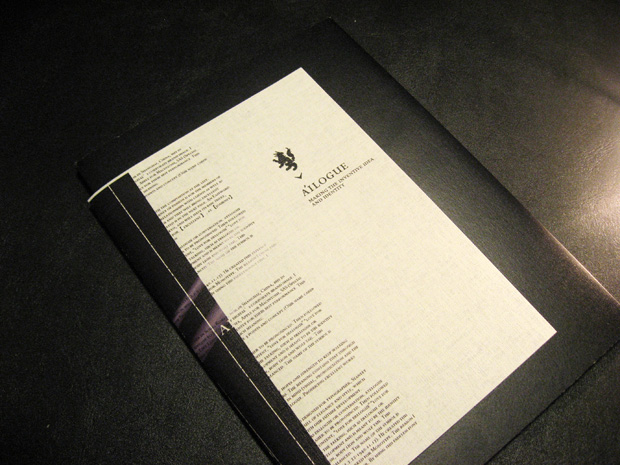
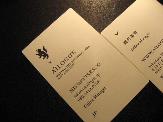
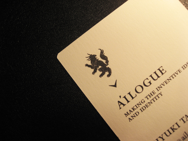
A'ILOGUE™ VI : logo design

ailogue_logo1.gif

ailogue_logo2.gif

ailogue_logo3.gif

A'ILOGUE™ visual identity
logo design + conceptwork


........

parent organization : puneet talwer ( AYD Inc. NYC )
visual identity : tomomichi ikeda ( ungraffi )
art direction + graphic design : tomomichi ikeda ( ungraffi )
project management : miyuki takano ( a'ilogue )
logotype base : Perpetua SC
symbol name : - agile -
......

Firstly, as an origin of the company name, ay digital sets up its East Asian foothold neither in Soul, Korea,
nor in Shanghai, China, but in Tokyo, Japan. This may indicates that we want to emphasis on our high quality work unique to Japan as ay digital’s corporate brand image.
we want to express that this Japan based Tokyo office is a team with Japanese high quality.
Like Lexus for Toyota, Apple for Macintosh, SAS (Special Air Service) for British armed forces, there are many brands and organizations that are known independently for their best performance. This company name represents my wish that Tokyo office for ay digital inc. will be known as the best team in such meaning.

concept by tomomichi ikeda ( ungraffi )


November 7, 2010

A'ILOGUE™ VI : stationary

ailogue_stationary1.jpg

ailogue_stationary2.jpg

ailogue_stationary5.jpg

A'ILOGUE™ visual identity
stationary - envelope and file cover -

........

parent organization : puneet talwer ( AYD Inc. NYC )
visual identity : tomomichi ikeda ( ungraffi )
art direction + graphic design : tomomichi ikeda ( ungraffi )
print : STRT print
paper : Vent Nouveau white and tant select 100kg

......


November 2, 2010

A'ILOGUE™ VI : business card

ailogue_namecard1.jpg

ailogue_namecard2.jpg

A'ILOGUE™ visual identity
lbusiness card design

........

parent organization : puneet talwer ( AYD Inc. NYC )
visual identity : tomomichi ikeda ( ungraffi )
art direction + graphic design : tomomichi ikeda ( ungraffi )
print : graphic print
paper : Vent Nouveau white 230kg

......

About the logo symbol,
It symbolizes our new business development and is meant to be the identity for ailogue. It symbolizes Japanese history and elegance. Whole silhouette represent flame, head dragon, body lion and wolf tail.
This symbolizes the richness of our various values. It also means that the animal is kinetic, strong and well balanced.
The name of the symbol is “agile”.


November 1, 2010

seraku brandbrochure

seraku_brochure2.jpg

seraku_brochure3.jpg

seraku_brochure4.jpg

seraku co., ltd.
brandbrochure

........

artwork : tadashi ura ( gleamix )
art direction + graphic design : tomomichi ikeda ( ungraffi )
translation : jun nakamura ( four-eighty )
print : minet printing
paper : kirabiki white PL 180kg

......


copyright ungraffi [ tomolog ] , all rights reserved.
web : www.ungraffi.org
contact : info@ungraffi.org
from jpn / england